Accurate text padding from Avocode to CSS
Avocode is a big time saver when converting PSD to HTML. But there is a minor problem in Avocode (2.16.6-). It is related to vertical padding of text blocks. In this article we demonstrate, investigate and solve (in a way) the problem.
Demmonstration
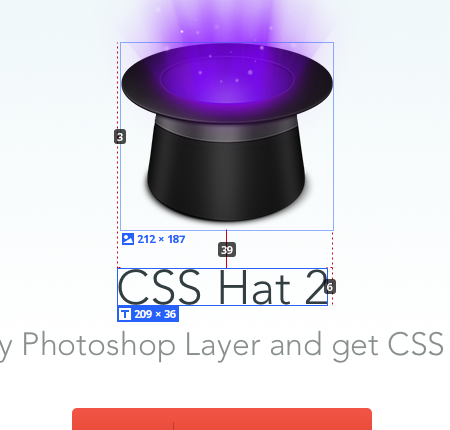
Let's look at a part of a sample PSD project of Avocode

There are an image and two text boxes below it. The app shows that distance between the image and the first text box is 39 px:

Let's make corresponding HTML:
<body>
  <img.image src='logo.png'>
  <div class='text-1'>
    CSS Hat 2
  </div>
  <div class='text-2'>
    Select any Photoshop Layer and get CSS instantly.
  </div>
</body>
and CSS:
body
  text-align center

image
  ;

text-1
  /* Style for "CSS Hat 2" */
  width: 209px;
  height: 36px;
  color: #323e41;
  font-family: Avenir;
  font-size: 48px;
  font-weight: 300;
  line-height: 18px;

text-2
  /* Style for "Select any" */
  width: 705px;
  height: 33px;
  color: #898e8f;
  font-family: Avenir;
  font-size: 32px;
  font-weight: 300;
  line-height: 18px;
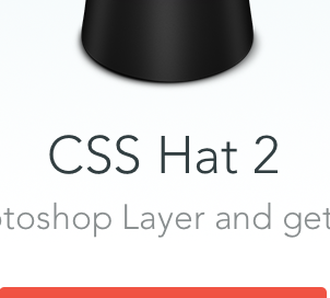
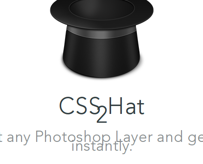
What we get is:

After small fixes like deleting unecessary width properties we come much closer.
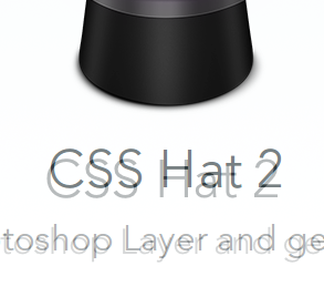
The demo now looks ok by itself, but let's check with pixelperfect:

As you see the padding for first text block is significally less than needed.
Why?
In CSS a single line text block has height equal to its font-size multiplided by value of line-height property. If line-height is a multiplier. If line-height is an absolute value the height equals to the exact value of line-height.
In our example Avocode generates the following CSS code for the first block:
/* Style for "CSS Hat 2" */
width: 209px;
height: 36px;
color: #323e41;
font-family: Avenir;
font-size: 48px;
font-weight: 300;
line-height: 18px;
Here font-size is 48px, but line-height is absolute and equals to 18px. So, naturally a block like this would take 18px. By default blocks has visible overflow, so the text is not clipped by 209 x 36 box, but rather wrapped and then just go down out of the box.
The problem with calculations of Avocode is that browser renders text not exactly from top of the width × height box specified by the app, but according to its font-size and line-height. To illustrate this let's wrap the text block and add outlines to the wrapper (red) and the block itself (green):
The text as the browser renders it aligns to the bottom edge of the box, not the top.
This difference is actually a source of the problem.
Solution
To compenstate for this difference we could do a simple math.
Foot note: as far as i understand the Avenir font in the design and demos here is not free.
shitpoet@gmail.com